


Missing Pointer in ShadCN: Why Buttons Are Losing Cursor Feedback
Views: 0
Ever hovered over a beautiful ShadCN UI button and noticed something odd? If you’re dealing with a Missing Pointer in ShadCN, you’re not alone.
The Case of the Missing Pointer
You’re building a slick React app. Everything looks great — until one day you hover over a button, and… nothing. Missing Pointer in ShadCN. No visual clue it’s clickable.
This isn’t just a nitpick. It’s a UX regression that confuses users and violates accessibility norms.
So why is this happening — especially in projects using ShadCN UI or Radix UI?
Bob’s Encounter: Buttons Behaving Badly
Bob, our favorite developer-next-door, had just refactored a form using the trendy ShadCN UI components. Over dinner, he proudly demoed the new UI to his partner.
“It’s all accessible, keyboard-friendly, and elegant,” he beamed.
But then Taco, his golden retriever, accidentally bumped the trackpad. Bob hovered over a primary button — and noticed…
No pointer cursor.
“Huh,” he muttered. “I thought this was a button.”
Technical Dive: Why It’s Happening
Let’s break down the why, particularly in ShadCN + Radix setups.
1. The Expected Behavior
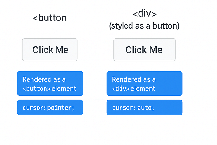
Normally, a <button> element has a default browser style of:
cursor: pointer;That’s what gives users that “clickable” feedback.
2. The Unexpected Override
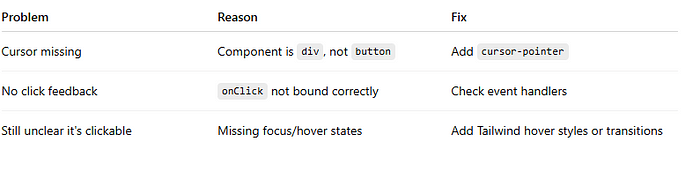
In Radix UI (which ShadCN is built on), many components are divs with button behavior added manually for accessibility and keyboard navigation.
Why? To maximize flexibility and composability. But the trade-off is: they’re not real <button> elements.
Thus, unless cursor: pointer is manually added, the element behaves like a div—with the default cursor: auto.
3. Where ShadCN Fits In
ShadCN UI takes Radix primitives and styles them using Tailwind CSS. But if you’re using or extending components and forget the cursor-pointer class, you’ll get:
- Visually a button
- Functionally a button
- But no pointer cursor
Example: a ShadCN button might look like this:
<Button className="bg-primary text-white">
  Submit
</Button>
But it’s missing:
<Button className="bg-primary text-white cursor-pointer">
  Submit
</Button>
Best Practices & Fixes
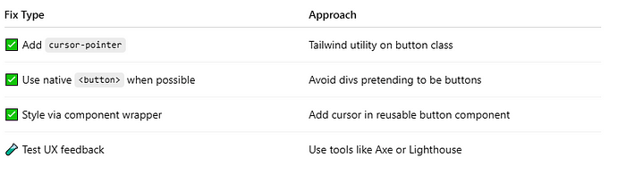
Here’s Bob’s updated fix in his ShadCN-based app:
<Button className="cursor-pointer">Click Me</Button>Or if extending a component:
const CustomButton = forwardRef((props, ref) => (
  <div ref={ref} className="cursor-pointer" {...props} />
));
Troubleshooting Tips
Small Thing, Big Impact
Bob learned something valuable: small UX details matter.
Users rely on micro-feedback — like the pointer cursor — to navigate interfaces confidently. Modern UI systems like Radix and ShadCN offer flexibility, but that power comes with responsibility.
Key Takeaways
- Always verify visual and behavioral feedback for interactive elements
- Don’t assume accessibility = full usability
- Tailwind needs explicit
cursor-pointerwhen using non-native buttons
Find us
Balian’s Blogs Balian’s
linkedin Shant Khayalian
Facebook Balian’s
X-platform Balian’s
web Balian’s
Youtube Balian’s
#UXDesign #ReactJS #ShadCN #RadixUI #TailwindCSS #WebAccessibility #FrontendTips #DevExperience #UIUX #CursorPointer #WebDev